
Delta Dental Provider Search Redesign
Background
This project was in a collaborative program called Diversify by Design and San Francisco State University to redesign their dental provider search pages to make finding a dentist practitioner an easier and more pleasant experience for their users.
Team
My Role
Hannah Hum
Samantha Chang
Monique Ferronatto
Justin Rodrigo
Tiffany Liang
Maya Ellis
UX Researcher
UI Designer
Tools
Figma
Lucidchart
Timeline
October-December 2022
3 months
The Problem
The Provider Search experience is limited in its ability to match members with the right dentist for their needs, resulting in calls to the contact center. 80% of visitors to the Provider Search interface do not use the Refine Search filtering tool; however, the 20% who do use it,
use it in-depth. The limited use of this feature creates a gap between the current patient experience and an experience that fully meets patient needs.
Solution
Delta Dental Insurance can better meet their patients’ needs through an enhanced filtering feature that makes search conditions clearly discoverable and flexible to use. By improving the filter and clarifying the hierarchy of search result provider cards, the Provider Search tool can better match user expectations.
Defining the Problem
Research Data

The research provided by Delta Dental indicated that the inability to find a dentist on their site compromises trust. Their study found that 70% of respondents did not find what they were looking for, while 80% didn’t use the refine search tool. However, when participants did use the tool, they used it in depth.
To help users successfully find a dentist, build that trust, and reduce call center costs, we asked how might we make the search process more proactive and search refinement more discoverable and flexible for users.
Heuristic Evaluation

We conducted a heuristic evaluation where we compared the current Find a Dentist tool against usability best practices and brainstormed recommendations to increase the tool’s usability. Some of the recommendations from this evaluation that we built out include:
-
A proactive advanced search
-
A more discoverable filter location with quick filter options
-
Increased visibility and flexibility of applied filters on the search results page through filter tags
-
Clearly articulated attributes on product cards
Competitive Analysis
We also conducted a comparative analysis to see the features and interactions that other provider or service search tools use to identify interaction and filter patterns that could improve the Delta Dental experience. We mapped search results based on level of detail and hierarchy and evaluated other provider search tools based on heuristics, interaction patterns, and content. *mention what hierarchy is (vis hierarchy)
The chart at the bottom right includes a few of the attributes we looked at such as discoverability, user freedom and control, and their map interactions.

Site Map

We created a site map and used the research provided by Delta Dental along with our heuristic evaluation and comparative analysis to highlight potential intervention points.
The potential intervention points on where we could improve upon Delta Dental's search were in the initial Find a Dentist pages, Research Result Page, the design of how dentist information is displayed, and the Refine Search function.
User Goals & Tasks

We split our user goals and tasks into 3 parts:
1.Initial search: Patients need to search for dentists based on individual needs.
2.Refine search: Patients need to quickly identify and adjust their filter settings.
3.Select provider: Patients need to quickly see more information about the dentists that populate in search results
User Task Flow

The user task flow was updated to allow the user to more accurately identify their needs when looking for a dental provider.
Personas
After identifying the main problems users are having with Delta Dental's provider search.


Sketch • Prototype • Test • Refine
Usability Testing
We first conducted usability tests of our redesigned prototype with six users of varying experience with practitioner provider searches, then
synthesized our notes and observations into an affinity map based on the three areas that we focused on: the initial search, search refinement, and listing content and hierarchy. We also made note of what worked, what didn’t, and what could be improved.


What needs Improvement
What worked well
-
Initial search
-
50% used advanced search
-
-
Refine search
-
100% successfully discovered and used the filter tool and drop downs
-
-
Search results & listing pages
-
100% referred to the attribute check marks on listing card in narrowing their search
-
100% commented on the clarity of listing card and page content
-
66% commented on clarity of listing card and page content
-
-
Overall too
-
100% reported that the tool was easy to use and felt confident they would find a provider that meets their needs.
-
-
Initial Search
-
Guided search needs to be more discoverable and goal-oriented: use questions and colloquial terms
-
-
Refine Search
-
Update filter categories: update taxonomy, match categories to user mental models (card sort)
-
Update filter mechanics: reset all option, users forget to select apply button, visual hierarchy
-
-
Search Results & listing pages
-
Update search results mechanics: fixed tags, auto-scroll isn't enough- users want pin labels
-
Hierarchy and additional attributes on listing pages: placement of information, add a years of experience filter
-
01 Search Entry
HYPOTHESIS
More robust search entry options will help users refine their search at first “Find a Dentist” touchpoint.
-
Basic search: a quick initial experience
-
Advanced search option will prime increased use of the search results page filters
-
-
Advanced search: a targeted experience
-
Filter from the start, more likely to meet user needs
-
Familiarize refinement attributes to narrow down further
-
-
Guided search: a supportive experience
-
A series of guided, goal-oriented questions walk users through filter parameters and FAQs
-
During the early concept stages, our main focus was to bring the search refinement feature to the beginning of the user flow.

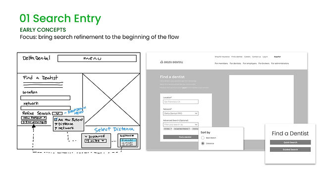

During the early concept stages, we wanted to explore ways to bring the search refinement feature to the start of the user flow.

02 Refine Search
HYPOTHESIS
Increased filter discoverability and flexibility will lead to increased filter use and targeted provider searches.
-
Filter placement:
-
Placing the filter on the left will increase discoverability
-
-
Quick filter:
-
Persistent shortcuts will increase overall use of filters
-
-
Filter tags:
-
Quick and flexible adjustment of search parameters
-


We did additional testing on the site's filter by conducting a card sort with four participants.
Our takeaways from the testing were:
-
Confusion: specialties, specialized care, and board-certified need context
-
Participant with medical knowledge thought that each type of dental board should be included.
-
Participants without medical knowledge wanted to use “board-certified” as a larger category
-
“Treats children” as a speciality or specialized care; 2 participants wrote in pediatric dentistry as a provider specialty
-
-
“Office access” to “office amenities”
-
4 participants preferred “office amenities” to “office access” (wrote in category)
-
1 participant confused office access for extended hours
-
-
Include Ratings and Years of Experience as filter categories
During the early concept stages, our main focus was to highlight the discoverability and flexible use of filters when searching for a dentist.


Refinement: Update filter categories and mechanics will better match user mental models for successful search by updating
The filter mechanics also need to be fine-tuned to support a smoother experience. Users tended to not click on apply when the filters were expanded, so the filter selection did not update. This led to frustration so there needs to be a way to ensure selected filters are applied.
Some mechanics that were needed to create a smoother experience would include a clear all or reset option. The filter drop downs also needed updating, as some only have one level, which raised questions about the overall hierarchy of the filter.

In the refined version, the filter is updated with parameters and organization.We added sort by ratings and changed the office access to office amenities, along with mini-tips to provide context for confusing categories and two new filter categories: years of experience and virtual visits.
We initially wanted the filter to auto-update as filters are selected, but based on mentor feedback, we ended up balancing engineering needs with user needs, through an error dialog. If users have selected filters and click out without selecting “apply,” the apply filter dialog will prompt them to apply their filter selections.
03 Search results & listing pages
HYPOTHESIS
Updated listing content and hierarchy will enable users to make more informed decisions on the search results page and reduce time spent clicking through individual listing pages.
-
Feature indicators:
-
Check marks for quick scanning of listing cards
-
-
Map interactivity:
-
Map will scroll with listing card scroll to orient user attention
-
-
Listing page hierarchy:
-
Provide the information users want and expect upfront
-
During the early concept stages, our main focus was on the filter tags, and the card listings on the search results page.


During the early concept stages, our main focus was to highlight the discoverability and flexible use of filters when searching for a dentist.

-In our user test, we asked user to adjust their search. The filter tags were attached to the scroll instead of fixed so they didn’t use the tags. Participants then reported they would have used them if they’d seen the tags so we need to fix the filter tags to maintain discoverability.

During our user test, we asked users to adjust their search. The filter tags were attached to the scroll instead of fixed so they didn’t use the tags. Participants would then report that they would have used them if they’d seen the tags so we need to fix the filter tags to maintain discoverability.
To remediate this, we moved the filter tags into the fixed search entry box at the top of the page and updated the scroll interaction of the map so that mini-tips with provider information opens up on the scroll.
As the user scrolls through the product listings cards, the corresponding section of the map also scrolls along while the pin on the map prompts a mini-tip with the provider’s information.


In our final refinement, the listing page hierarchy and content need to be updated, and the search results should be further refined to align with the information that users felt would aid their decision making.This includes bringing office information and reviews higher up on the page and moving content like reporting inaccuracies or licensing further down on the page. The listing page also got updated, making the reviews are higher in the hierarchy. We added some breathing room after “dentist info” and moved licensing down. On the right side, we moved office info up and the map down to meet user expectations from other sites and moved inaccurate information reporting to the bottom of the page.